Note
This page was generated from a Jupyter notebook. You can download the notebook from the notebooks/ directory in the repository.
Exploratory Data Analysis: Mars Hyperspectral Imaging
Author: Riccardo Finotello riccardo.finotello@cea.fr
Introduction
In this tutorial, we explore hyperspectral imaging (HSI) data from Mars, specifically from the CRISM instrument aboard the Mars Reconnaissance Orbiter. Hyperspectral imaging allows us to capture detailed spectral information for each pixel in an image, enabling the identification of minerals and materials, based on information on the surface.
1. Setup and Data Loading
First, we import the necessary libraries and load our hyperspectral image data.
[1]:
# Import required libraries
import numpy as np
import matplotlib as mpl
from matplotlib import pyplot as plt

# Import the HSIMars class from our package
from hsimars import HSIMars

# Configure matplotlib for better-looking plots
plt.style.use("grayscale")
plt.rcParams["figure.figsize"] = (12, 6)
plt.rcParams["font.size"] = 16

print("✅ Libraries imported successfully!")
print(f"NumPy version: {np.__version__}")
✅ Libraries imported successfully!
NumPy version: 2.3.3
1.1 Initialize the HSIMars Object
We load one of the CRISM images along with its ground truth annotations. The ground truth labels tell us what materials are present at each pixel location (annotated by experts).
[2]:
# Path to our hyperspectral image and annotations
# Note: Adjust these paths based on your directory structure
hdr_path = "../data/HC_frt0000580c_07_if164j_ter3.hdr"
annotations_path = "../data/HC_ground_truth.mat"

# Initialize the HSIMars object
# This doesn't load the data yet, but it uses lazy loading for efficiency
hsi = HSIMars(hdr_path=hdr_path, annotations=annotations_path)

print("✅ HSIMars object created successfully!")
print(f"📁 Header file: {hsi.hdr_path.name}")
print(
    f"🏷️  Annotations file: {hsi.annotations.name if hsi.annotations else 'None'}"
)
✅ HSIMars object created successfully!
📁 Header file: HC_frt0000580c_07_if164j_ter3.hdr
🏷️  Annotations file: HC_ground_truth.mat
2. Understanding the Data Structure
We then load the hyperspectral image and examine its structure.
[3]:
# Load the hyperspectral image data
img_data = hsi.get_img()

print("=" * 50)
print("HYPERSPECTRAL IMAGE PROPERTIES")
print("=" * 50)
print(f"📐 Image shape: {img_data.shape}")
print(f"   - Height (rows): {img_data.height} pixels")
print(f"   - Width (columns): {img_data.width} pixels")
print(f"   - Spectral channels: {img_data.channels} bands")
print(f"\n📊 Data type: {img_data.dtype}")
print(
    f"🌈 Wavelength range: {img_data.wavelength.min():.2f} - {img_data.wavelength.max():.2f} nm"
)
print(f"💾 Memory size: {img_data.hsi.nbytes / (1024**2):.2f} MB")
print("=" * 50)
==================================================
HYPERSPECTRAL IMAGE PROPERTIES
==================================================
📐 Image shape: (418, 600, 483)
   - Height (rows): 418 pixels
   - Width (columns): 600 pixels
   - Spectral channels: 483 bands

📊 Data type: float32
🌈 Wavelength range: 436.13 - 3896.76 nm
💾 Memory size: 462.10 MB
==================================================
2.1 Interpreting the Data Structure
Break down the structure of the image:
Image Dimensions: the image is organized as a 3D array with shape
(height, width, channels)Height & Width: spatial dimensions (like a regular photo)
Channels: the spectral dimension (each channel corresponds to a specific wavelength)
Data Type:
float32(32-bit floating point numbers representing reflectance values)Wavelength Range: spans from visible (400-700 nm) through near-infrared (700-3000 nm)
[ ]:
# Let's examine the wavelength array more closely
# The wavelength array tells us which wavelength (in nanometers)
# each band represents
print("SPECTRAL BAND INFORMATION")
print("=" * 50)

# Display first 10 wavelengths
# [:10] is slice notation: take elements from index 0 to 9
# .round(2) rounds to 2 decimal place for cleaner display
print(f"First 10 wavelengths (nm): {img_data.wavelength[:10].round(2)}")

# Display last 10 wavelengths
# [-10:] means "last 10 elements" (negative indices count from end)
print(f"Last 10 wavelengths (nm): {img_data.wavelength[-10:].round(2)}")

# Calculate spacing between consecutive bands
# np.diff() computes differences between adjacent elements
# For array [1, 3, 7], np.diff() returns [2, 4] (3-1=2, 7-3=4)
# .mean() then averages these differences
print(
    f"\nMean spacing between bands: {np.diff(img_data.wavelength).mean():.2f} nm"
)
# .min() finds the smallest spacing
print(f"Min spacing: {np.diff(img_data.wavelength).min():.2f} nm")
# .max() finds the largest spacing
print(f"Max spacing: {np.diff(img_data.wavelength).max():.2f} nm")
print("=" * 50)
SPECTRAL BAND INFORMATION
==================================================
First 10 wavelengths (nm): [436.13 442.63 449.14 455.64 462.15 468.65 475.16 481.67 488.17 494.68]
Last 10 wavelengths (nm): [3836.69 3843.36 3850.04 3856.71 3863.39 3870.06 3876.73 3883.41 3890.08
 3896.76]

Mean spacing between bands: 7.18 nm
Min spacing: 6.50 nm
Max spacing: 158.63 nm
==================================================
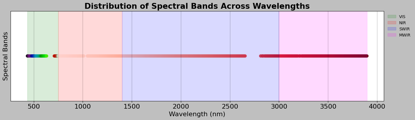
2.2 Spectral Band Categories
Different wavelength regions tell us different things about materials. Thus, it is appropriate to try to categorise our spectral bands:
[5]:
# Categorize wavelengths into standard spectral regions
# Different wavelength ranges tell us different things about materials
wl = img_data.wavelength

# Count how many bands fall into each spectral region
# np.sum() counts how many True values are in a boolean array
vis_bands = np.sum(wl < 750)  # Visible light: wavelength < 750 nm
nir_bands = np.sum((wl >= 750) & (wl < 1400))  # Near-Infrared: 750-1400 nm
swir_bands = np.sum((wl >= 1400) & (wl < 3000))  # Short-Wave IR: 1400-3000 nm
mwir_bands = np.sum(wl >= 3000)  # Mid-Wave IR: >= 3000 nm

# Display the breakdown
print("SPECTRAL REGION BREAKDOWN")
print("=" * 50)
# {:3d} formats as 3-digit integer, right-aligned
print(f"📗 VIS  (Visible, < 750 nm):          {vis_bands:3d} bands")
print(f"📕 NIR  (Near-Infrared, 750-1400 nm): {nir_bands:3d} bands")
print(f"📘 SWIR (Short-Wave IR, 1400-3000 nm): {swir_bands:3d} bands")
print(f"📙 MWIR (Mid-Wave IR, > 3000 nm):      {mwir_bands:3d} bands")
print(f"\nTotal: {vis_bands + nir_bands + swir_bands + mwir_bands} bands")
print("=" * 50)

# Create a visualization of the spectral sampling
fig, ax = plt.subplots(figsize=(14, 4), layout="constrained")

# Plot visible bands
# Create boolean mask to select only visible wavelengths
visible_mask = wl < 750
# ax.scatter creates a scatter plot (one point per band)
# c=wl[visible_mask] colors points by their wavelength value
# cmap="nipy_spectral" uses a rainbow-like colormap for visible light
# s=50 sets the size of the points
ax.scatter(
    wl[visible_mask],  # x positions: wavelengths
    np.ones_like(wl[visible_mask]),  # y positions: all at y=1
    c=wl[visible_mask],  # color by wavelength
    cmap="nipy_spectral",  # colormap
    s=50,  # point size
    alpha=0.85,  # slight transparency
)

# Plot infrared bands (all wavelengths >= 750 nm)
infrared_mask = wl >= 750
ax.scatter(
    wl[infrared_mask],
    np.ones_like(wl[infrared_mask]),
    c=wl[infrared_mask],
    cmap="Reds",  # Use red colors for infrared
    s=50,
    alpha=0.85,
)

# Add colored background spans to show spectral regions
# axvspan creates a vertical colored rectangle
ax.axvspan(wl.min(), 750, alpha=0.15, color="green", label="VIS")
ax.axvspan(750, 1400, alpha=0.15, color="red", label="NIR")
ax.axvspan(1400, 3000, alpha=0.15, color="blue", label="SWIR")
ax.axvspan(3000, wl.max(), alpha=0.15, color="magenta", label="MWIR")

# Label axes and add title
ax.set_xlabel("Wavelength (nm)")
ax.set_ylabel("Spectral Bands")
ax.set_title(
    "Distribution of Spectral Bands Across Wavelengths",
    fontweight="bold",
)
ax.set_yticks([])  # Hide y-axis ticks (not meaningful here)
# Place legend outside plot on the right
ax.legend(loc="upper left", bbox_to_anchor=(1, 1), frameon=False, fontsize=10)
ax.grid(True, alpha=0.3)
plt.show()
SPECTRAL REGION BREAKDOWN
==================================================
📗 VIS  (Visible, < 750 nm):           38 bands
📕 NIR  (Near-Infrared, 750-1400 nm):  94 bands
📘 SWIR (Short-Wave IR, 1400-3000 nm): 218 bands
📙 MWIR (Mid-Wave IR, > 3000 nm):      133 bands

Total: 483 bands
==================================================
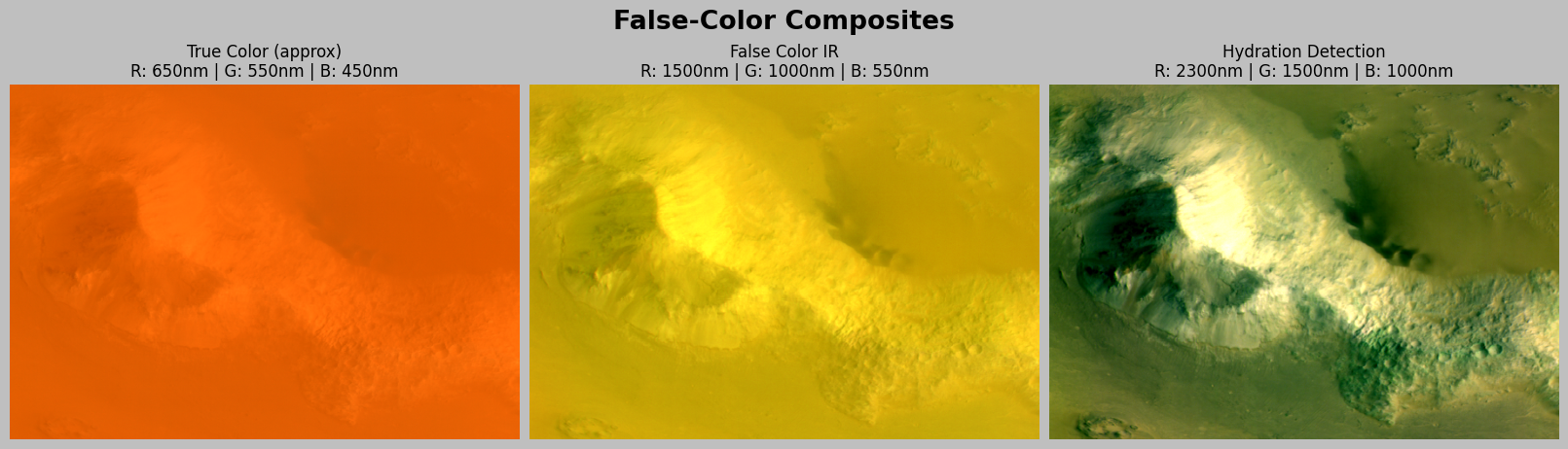
3. Visual Exploration: False-Color Images
Hyperspectral data has hundreds of channels, but we can only display 3 at a time (RGB) for rendering. We can create some false-color visualisations to see spatial patterns in the data.
3.1 What is a False-Color Image?
A false-color image displays data using colors that do not match the true colors we would see with our eyes. This is done to:
Highlight features not visible to the human eye (e.g., infrared radiation)
Enhance contrast between different materials
Visualize data outside the visible spectrum
How it works: We select three spectral bands from our hyperspectral data and map them to the Red, Green, and Blue channels of a standard RGB image. By choosing different combinations of wavelengths, we can create images that emphasize different material properties.
Example: A “true color” image uses wavelengths around 650nm (red), 550nm (green), and 450nm (blue) to approximate what our eyes see. A “false color IR” image might use 1500nm (mapped to red), 1000nm (mapped to green), and 550nm (mapped to blue) to highlight infrared features invisible to humans.
[ ]:
# Define a helper function to find the band index closest to a given
# wavelength. This function is useful because we often want to work
# with specific wavelengths (like 650 nm for red light), but our data
# is organized by band index (0, 1, 2, ...)
def find_band_index(wavelength_nm):
    """
    Find the band index closest to a given wavelength.

    How it works:
    1. Takes the absolute difference between the target wavelength and all wavelengths
    2. Finds the index of the minimum difference (closest match)

    Example: If we want 650 nm and our bands are [640, 655, 670, ...],
    this function will return index 1 (for 655 nm, which is closest to 650).
    """
    return np.argmin(np.abs(img_data.wavelength - wavelength_nm))


# Define different band combinations for false-color visualization
# Each tuple contains (Red wavelength, Green wavelength, Blue wavelength)
# These are measured in nanometers (nm)
band_combos = {
    "True Color (approx)": (
        650,
        550,
        450,
    ),  # Approximates what our eyes would see
    "False Color IR": (1500, 1000, 550),  # Emphasizes minerals
    "Hydration Detection": (2300, 1500, 1000),  # Good for hydrated minerals
}

# Create a figure with 3 subplots (one for each band combination)
# figsize=(16, 5) means 16 inches wide, 5 inches tall
# layout="constrained" automatically adjusts spacing between subplots
fig, ax = plt.subplots(1, 3, figsize=(16, 5), layout="constrained")

# Loop through each subplot and each band combination
# zip() pairs up each axis (ax) with each dictionary item
for ax, (name, (r_wl, g_wl, b_wl)) in zip(ax, band_combos.items()):
    # Step 1: Find which band indices correspond to our desired wavelengths
    r_idx = find_band_index(r_wl)
    g_idx = find_band_index(g_wl)
    b_idx = find_band_index(b_wl)

    # Step 2: Extract the three bands from our hyperspectral cube
    # img_data.hsi has shape (height, width, channels)
    # [:, :, r_idx] means "all rows, all columns, but only band r_idx"
    r_band = img_data.hsi[:, :, r_idx]
    g_band = img_data.hsi[:, :, g_idx]
    b_band = img_data.hsi[:, :, b_idx]

    # Step 3: Stack the three bands into an RGB image
    # np.dstack stacks arrays along the third dimension (depth)
    # This creates shape (height, width, 3) which is a standard RGB image
    rgb = np.dstack([r_band, g_band, b_band])

    # Step 4: Normalize to 0-1 range for display
    # We use percentiles instead of min/max to avoid extreme outliers
    # The 2nd and 98th percentiles represent the range where most data lies
    rgb_min = np.percentile(rgb, 2)  # Bottom 2% threshold
    rgb_max = np.percentile(rgb, 98)  # Top 2% threshold
    # Normalize: subtract minimum, divide by range, then clip to [0, 1]
    rgb_normalized = np.clip((rgb - rgb_min) / (rgb_max - rgb_min), 0, 1)

    # Step 5: Display the image
    ax.imshow(rgb_normalized)
    ax.set_title(
        f"{name}\nR: {r_wl}nm | G: {g_wl}nm | B: {b_wl}nm", fontsize=12
    )
    ax.axis("off")  # Hide the x and y axis labels

# Add a title above all subplots
plt.suptitle("False-Color Composites", fontweight="bold", y=1.02)
plt.show()
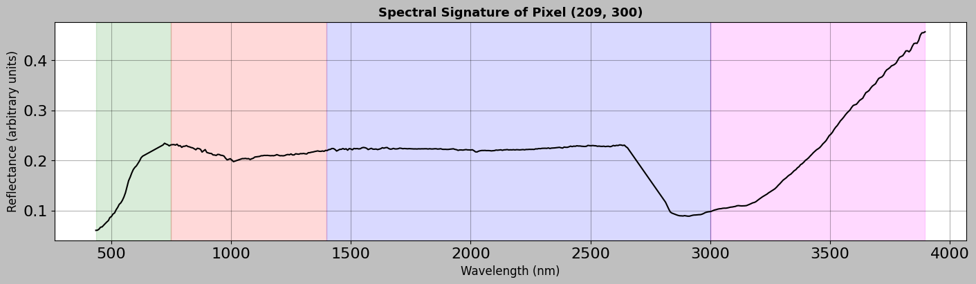
4. Spectral Signature Analysis
Now let us look at the spectral signatures, since each pixel contains a full spectrum that acts like a fingerprint for material identification.
4.1 Single Pixel Spectrum
Consider the spectrum of a single pixel to understand what information it contains.
[7]:
# Select a pixel to analyze (let's choose one near the center of the image)
# The // operator does integer division (e.g., 100 // 2 = 50)
center_row = img_data.height // 2
center_col = img_data.width // 2

# Extract the spectrum for this pixel
# Remember: img_data.hsi has shape (height, width, channels)
# So img_data.hsi[row, col, :] gives us all spectral bands for one pixel
# The result is a 1D array with length equal to the number of channels
spectrum = img_data.hsi[center_row, center_col, :]

# Create a comprehensive plot of the spectrum
fig, ax = plt.subplots(figsize=(14, 4), layout="constrained")

# Plot the spectrum as a line graph
# - img_data.wavelength: x-axis (wavelengths in nm)
# - spectrum: y-axis (reflectance values)
# - "k-": black solid line ("k" = black, "-" = solid line)
# - linewidth=1.5: makes the line slightly thicker for visibility
ax.plot(
    img_data.wavelength, spectrum, "k-", linewidth=1.5, label="Raw Spectrum"
)

# Add colored background regions to show different spectral regions
# axvspan creates a vertical colored span between two x values
# alpha=0.15 makes it semi-transparent so we can see the plot underneath
ax.axvspan(wl.min(), 750, alpha=0.15, color="green")  # Visible light
ax.axvspan(750, 1400, alpha=0.15, color="red")  # Near-infrared
ax.axvspan(1400, 3000, alpha=0.15, color="blue")  # Short-wave infrared
ax.axvspan(3000, wl.max(), alpha=0.15, color="magenta")  # Mid-wave infrared

# Label the axes
ax.set_xlabel("Wavelength (nm)", fontsize=12)
ax.set_ylabel("Reflectance (arbitrary units)", fontsize=12)
ax.set_title(
    f"Spectral Signature of Pixel ({center_row}, {center_col})",
    fontsize=13,
    fontweight="bold",
)
ax.grid(True, alpha=0.3)  # Add a light grid for easier reading
plt.show()
4.2 Comparing Multiple Pixel Spectra
Compare spectra from different locations to see how much they differ.
[8]:
# Select several pixels from different parts of the image to compare
# Each tuple contains (row, column, descriptive_label)
# We use integer division (//) to divide the image into regions
sample_pixels = [
    (center_row, center_col, "Center"),
    (img_data.height // 4, img_data.width // 4, "Upper Left"),
    (img_data.height // 4, 3 * img_data.width // 4, "Upper Right"),
    (3 * img_data.height // 4, img_data.width // 4, "Lower Left"),
    (3 * img_data.height // 4, 3 * img_data.width // 4, "Lower Right"),
]

# Create a plot to compare all the spectra
fig, ax = plt.subplots(figsize=(14, 6), layout="constrained")

# Create a list of colors for each spectrum
# plt.cm.Set1 is a colormap with distinct colors
# np.linspace creates evenly spaced numbers between 0 and 1
# This gives us a different color for each pixel we're plotting
colors = plt.cm.Set1(np.linspace(0, 1, len(sample_pixels)))

# Loop through each pixel and its corresponding color
# zip() pairs up elements from sample_pixels and colors
for (row, col, label), color in zip(sample_pixels, colors):
    # Extract the spectrum for this pixel
    # spectrum is a 1D array containing reflectance at each wavelength
    spectrum = img_data.hsi[row, col, :]

    # Plot this spectrum on the same axes
    ax.plot(
        img_data.wavelength,  # x-axis: wavelengths
        spectrum,  # y-axis: reflectance values
        label=f"{label} ({row}, {col})",  # Legend label
        linewidth=2,  # Line thickness
        alpha=0.8,  # Slight transparency (0=transparent, 1=opaque)
        color=color,  # Use the color from our color list
    )

# Add colored background regions to identify spectral ranges
ax.axvspan(wl.min(), 750, alpha=0.1, color="green")  # Visible
ax.axvspan(750, 1400, alpha=0.1, color="red")  # Near-IR
ax.axvspan(1400, 3000, alpha=0.1, color="blue")  # Short-wave IR
ax.axvspan(3000, wl.max(), alpha=0.1, color="magenta")  # Mid-wave IR

# Add labels and formatting
ax.set_xlabel("Wavelength (nm)")
ax.set_ylabel("Reflectance (arbitrary units)")
ax.set_title("Spectral Variability Across Image Locations", fontweight="bold")
# Place legend outside the plot area on the right side
ax.legend(loc="upper left", bbox_to_anchor=(1, 1), frameon=False)
ax.grid(True, alpha=0.3)  # Add a subtle grid
plt.show()

4.3 Using the HSIMars Plotting Methods
The HSIMars class provides convenient methods for plotting.
[9]:
# Plot a single pixel spectrum with convex hull removal
# Convex hull removal normalizes the continuum to emphasize absorption features
print("Generating spectrum plot with convex hull removal...")
print(
    "(This enhances absorption features by removing the overall spectral shape)"
)

hsi.plot_spectra(
    px=[center_row, center_col],
    convex_hull=True,  # Apply continuum removal
    bands=True,  # Show spectral region labels
)
Generating spectrum plot with convex hull removal...
(This enhances absorption features by removing the overall spectral shape)

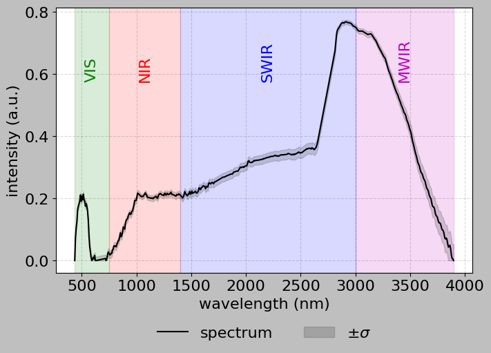
[ ]:
# Plot average spectrum of a region with standard deviation
# This shows spectral variability within a local area

# Create a list comprehension to generate all pixels in an 11x11 region
# centered on center_row, center_col
# List comprehension syntax:
# [expression for item in iterable for item in iterable]
# This creates a nested loop: for each dr from -5 to 5,
# for each dc from -5 to 5
region_pixels = [
    [center_row + dr, center_col + dc]  # Calculate actual row and column
    for dr in range(-5, 6)  # dr goes from -5 to 5 (11 values)
    for dc in range(-5, 6)  # dc goes from -5 to 5 (11 values)
]
# Result: region_pixels is a list of [row, col] pairs forming an 11x11 grid

print(
    f"Plotting average spectrum of {len(region_pixels)} pixels (11x11 region)"
)
print("The shaded area shows ±1 standard deviation")

# Use the HSIMars method to plot the spectrum
# When given multiple pixels, it automatically computes the mean and std
hsi.plot_spectra(
    px=region_pixels,  # List of pixel coordinates
    convex_hull=True,  # Apply continuum removal (normalizes the spectrum)
    bands=True,  # Show colored bands for different spectral regions
)
Plotting average spectrum of 121 pixels (11x11 region)
The shaded area shows ±1 standard deviation
5. Ground Truth Annotations
For supervised machine learning, we need labelled data. We thus explore the ground truth annotations.
[11]:
# Load the annotation data
ann_data = hsi.get_annotations()

print("=" * 50)
print("ANNOTATION DATA PROPERTIES")
print("=" * 50)
print(f"📐 Annotation shape: {ann_data.shape}")
print(f"   - Height: {ann_data.height} pixels")
print(f"   - Width: {ann_data.width} pixels")
print(f"📊 Data type: {ann_data.dtype}")
print(f"\n🏷️  Unique labels: {np.unique(ann_data.labels)}")
print(f"   Number of classes: {len(np.unique(ann_data.labels))}")
print("=" * 50)
==================================================
ANNOTATION DATA PROPERTIES
==================================================
📐 Annotation shape: (418, 600)
   - Height: 418 pixels
   - Width: 600 pixels
📊 Data type: uint8

🏷️  Unique labels: [0 1 2 3 4 5 6]
   Number of classes: 7
==================================================
5.1 Label Names Analysis
The annotation data includes human-readable mineral class names that can be accessed through the label_names dictionary. Here is how to work with label names for detailed analysis.
[ ]:
# Analyze label names for all three datasets
# We define a list of dictionaries, where each dictionary contains
# information about one dataset (its name and file paths)
datasets = [
    {
        "name": "HC (High-Ca Pyroxene)",
        "hdr": "../data/HC_frt0000580c_07_if164j_ter3.hdr",
        "ann": "../data/HC_ground_truth.mat",
    },
    {
        "name": "NF (Nili Fossae)",
        "hdr": "../data/NF_frt00003e12_07_if166j_ter3.hdr",
        "ann": "../data/NF_ground_truth.mat",
    },
    {
        "name": "UP (Unknown Plateau)",
        "hdr": "../data/UP_frt0000527d_07_if166j_ter3.hdr",
        "ann": "../data/UP_ground_truth.mat",
    },
]

# Loop through each dataset
for dataset in datasets:
    # Print a header line with equals signs for visual separation
    print(f"\n{'=' * 70}")
    print(f"Dataset: {dataset['name']}")
    print("=" * 70)

    # Load the HSI data with annotations for this dataset
    # Note: This creates a temporary HSIMars object just for this dataset
    hsi_temp = HSIMars(hdr_path=dataset["hdr"], annotations=dataset["ann"])

    # Get both image and annotation data
    # The data() method returns a tuple of (image_data, annotation_data)
    img_temp, ann_temp = hsi_temp.data()

    # Display basic information
    print(f"Image shape: {img_temp.shape}")
    print(f"Annotation shape: {ann_temp.shape}")

    # Get unique labels from the annotation array
    # np.unique() returns a sorted array of unique values
    unique_labels = np.unique(ann_temp.labels)
    # Exclude background (label 0) by filtering the array
    # The boolean expression (unique_labels > 0) creates a mask
    unique_labels = unique_labels[unique_labels > 0]

    print(f"\nNumber of classes: {len(unique_labels)}")
    print("\nClass distribution:")

    # Display each class with its name and pixel count
    total_labeled = 0  # Initialize a counter for all labeled pixels
    # sorted() ensures we process labels in numerical order
    for label_id in sorted(unique_labels):
        # Count how many pixels have this label
        # (ann_temp.labels == label_id) creates a boolean array
        # np.sum() counts how many True values there are
        count = np.sum(ann_temp.labels == label_id)
        total_labeled += count  # Add to our running total

        # Get the human-readable name from the label_names dictionary
        # .get() method allows us to provide a default value if key
        # doesn't exist
        if label_id in ann_temp.label_names:
            class_name = ann_temp.label_names[label_id]
        else:
            class_name = f"Unknown (ID: {label_id})"

        # Calculate percentage of total pixels
        percentage = (count / ann_temp.labels.size) * 100
        # Print with formatting: {:2d} means "2-digit integer"
        # {:25s} means "25-character string, left-aligned"
        # {:6d} means "6-digit integer"
        # {:5.2f} means "5 total digits, 2 after decimal"
        print(
            f"  {label_id:2d}. {class_name:25s} - "
            f"{count:6d} pixels ({percentage:5.2f}%)"
        )

    # Count and display background (unlabeled) pixels
    background_count = np.sum(ann_temp.labels == 0)
    background_pct = (background_count / ann_temp.labels.size) * 100
    print(
        f"\n  Background (unlabeled)        - "
        f"{background_count:6d} pixels ({background_pct:5.2f}%)"
    )
    print(f"  Total labeled pixels          - {total_labeled:6d}")
======================================================================
Dataset: HC (High-Ca Pyroxene)
======================================================================
Image shape: (418, 600, 483)
Annotation shape: (418, 600)

Number of classes: 6

Class distribution:
   1. Analcime                  -    940 pixels ( 0.37%)
   2. Plagioclase               -   1472 pixels ( 0.59%)
   3. Prehnite                  -   1560 pixels ( 0.62%)
   4. High-Ca Pyroxene          -   6963 pixels ( 2.78%)
   5. Serpentine                -   8697 pixels ( 3.47%)
   6. Margarite                 -    458 pixels ( 0.18%)

  Background (unlabeled)        - 230710 pixels (91.99%)
  Total labeled pixels          -  20090

======================================================================
Dataset: NF (Nili Fossae)
======================================================================
Image shape: (478, 600, 459)
Annotation shape: (478, 600)

Number of classes: 9

Class distribution:
   1. Fe-Olivine                -   8563 pixels ( 2.99%)
   2. Epidote                   -    996 pixels ( 0.35%)
   3. Chlorite                  -    386 pixels ( 0.13%)
   4. Bassanite                 -   3286 pixels ( 1.15%)
   5. Illite/Muscovite          -    228 pixels ( 0.08%)
   6. Mg-Carbonate              -   4867 pixels ( 1.70%)
   7. Plagioclase               -   1057 pixels ( 0.37%)
   8. Prehnite                  -   1161 pixels ( 0.40%)
   9. Serpentine                -   6166 pixels ( 2.15%)

  Background (unlabeled)        - 260090 pixels (90.69%)
  Total labeled pixels          -  26710

======================================================================
Dataset: UP (Unknown Plateau)
======================================================================
Image shape: (478, 600, 465)
Annotation shape: (478, 600)

Number of classes: 9

Class distribution:
   1. Analcime                  -   1751 pixels ( 0.61%)
   2. Bassanite                 -   5807 pixels ( 2.02%)
   3. High-Ca Pyroxene          -    432 pixels ( 0.15%)
   4. Illite/Muscovite          -    272 pixels ( 0.09%)
   5. Low-Ca Pyroxene           -   6774 pixels ( 2.36%)
   6. Mg-Smectite               -   1166 pixels ( 0.41%)
   7. Monohydrated sulfate      -    340 pixels ( 0.12%)
   8. Plagioclase               -    202 pixels ( 0.07%)
   9. Prehnite                  -    594 pixels ( 0.21%)

  Background (unlabeled)        - 269462 pixels (93.95%)
  Total labeled pixels          -  17338
5.2 Accessing Specific Mineral Pixels
You can use label names to find and work with pixels of specific mineral types.
[13]:
# Example: Find pixels of a specific mineral type and extract their information
# Get unique labels (excluding background)
unique_labels = np.unique(ann_data.labels)
unique_labels = unique_labels[unique_labels > 0]

# Check if we have any labeled data
if len(unique_labels) > 0:
    # Select the first class as an example
    example_label = unique_labels[0]

    # Get the human-readable name for this label
    # .get() method returns the value if key exists, otherwise returns the default
    example_name = ann_data.label_names.get(
        example_label, f"Unknown (ID: {example_label})"
    )

    # Find all positions (row, col) where this label appears
    # np.argwhere() returns array indices where condition is True
    # Result: 2D array with shape (num_pixels, 2) where each row is [row, col]
    example_positions = np.argwhere(ann_data.labels == example_label)

    print(f"Example: Accessing '{example_name}' pixels")
    print(
        f"  Found {len(example_positions)} pixels with label {example_label}"
    )

    if len(example_positions) > 0:
        print("\n  First 5 positions (row, col):")
        # [:5] takes only first 5 elements
        for row, col in example_positions[:5]:
            # {:3d} formats as 3-digit integer for alignment
            print(f"    ({row:3d}, {col:3d})")

        # Get the spectrum for the first pixel of this mineral
        # example_positions[0] is the first [row, col] pair
        first_pixel = example_positions[0]
        # Extract spectrum using the row and column coordinates
        spectrum = img_data.hsi[first_pixel[0], first_pixel[1], :]

        print(f"\n  Spectrum shape: {spectrum.shape}")
        print(f"  Mean reflectance: {spectrum.mean():.4f}")
        print(f"  Std reflectance: {spectrum.std():.4f}")
Example: Accessing 'Analcime' pixels
  Found 940 pixels with label 1

  First 5 positions (row, col):
    (139, 101)
    (139, 102)
    (139, 103)
    (139, 104)
    (139, 105)

  Spectrum shape: (483,)
  Mean reflectance: 0.1567
  Std reflectance: 0.0442
5.3 Understanding the Label Distribution
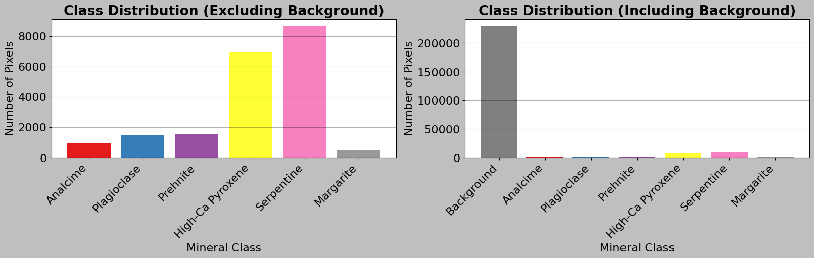
Consider how many pixels belong to each class and calculate class statistics.
[14]:
# Calculate class statistics to understand the distribution of labels

# Get all unique label values in the annotation array
unique_labels = np.unique(ann_data.labels)

# Create a dictionary to store the count for each label
# Dictionary comprehension: {key: value for item in iterable}
# This loops through each label and counts how many pixels have that label
label_counts = {
    label: np.sum(ann_data.labels == label) for label in unique_labels
}

print("\nCLASS DISTRIBUTION")
print("=" * 70)
# Calculate total number of pixels (height × width)
total_pixels = ann_data.height * ann_data.width

# Loop through each label in sorted order (0, 1, 2, ...)
for label in sorted(unique_labels):
    count = label_counts[label]  # Get count from our dictionary
    percentage = 100 * count / total_pixels  # Calculate percentage

    # Special handling for background (label 0)
    if label == 0:
        print(f"Background: {count:7d} pixels ({percentage:5.2f}%)")
    else:
        # For other labels, get the human-readable mineral name
        class_name = ann_data.label_names.get(label, f"Unknown (ID: {label})")
        # Print with formatted columns for alignment
        # {:25s} means "string with 25 characters, left-aligned"
        # {:7d} means "integer with 7 digits, right-aligned"
        print(f"{class_name:25s}: {count:7d} pixels ({percentage:5.2f}%)")

print("=" * 70)

# Create a pie chart for better visualization
# Calculate total labeled pixels (excluding background)
labeled_pixels = total_pixels - label_counts[0]

# Calculate percentage for each class (excluding background)
# List comprehension creates a new list by looping through unique_labels
class_percentages = [
    (label_counts[lab] / labeled_pixels * 100)
    for lab in unique_labels
    if lab != 0  # Skip background
]

# Get human-readable names for labels (excluding background)
class_labels_text = [
    ann_data.label_names.get(lab, f"Unknown (ID: {lab})")
    for lab in unique_labels
    if lab != 0
]

# Create labels including background for the second chart
class_labels_text_bg = ["Background"] + class_labels_text

# Create a figure with two subplots side by side
fig, (ax1, ax2) = plt.subplots(1, 2, figsize=(16, 5), layout="constrained")

# First subplot: Bar chart excluding background
# Generate a list of colors from the Set1 colormap
colors = plt.cm.Set1(np.linspace(0, 1, len(class_labels_text)))
# Create a bar chart
# range(len(...)) creates [0, 1, 2, ...] for x-axis positions
ax1.bar(
    range(len(class_labels_text)),  # x positions
    [
        label_counts[lab] for lab in unique_labels if lab != 0
    ],  # y values (counts)
    color=colors,  # Use our generated colors
)
ax1.set_xlabel("Mineral Class")
ax1.set_ylabel("Number of Pixels")
ax1.set_title("Class Distribution (Excluding Background)", fontweight="bold")
# Set x-axis tick positions and labels
ax1.set_xticks(range(len(class_labels_text)))
# rotation=45 rotates labels, ha="right" aligns them to the right
ax1.set_xticklabels(class_labels_text, rotation=45, ha="right")
ax1.grid(True, alpha=0.3, axis="y")  # Add horizontal grid lines

# Second subplot: Bar chart including background
ax2.bar(
    range(len(unique_labels)),  # x positions for all labels
    [
        label_counts[lab] for lab in sorted(unique_labels)
    ],  # All counts including background
    color=["gray"] + list(colors),  # Gray for background, then other colors
)
ax2.set_xlabel("Mineral Class")
ax2.set_ylabel("Number of Pixels")
ax2.set_title("Class Distribution (Including Background)", fontweight="bold")
ax2.set_xticks(range(len(unique_labels)))
ax2.set_xticklabels(class_labels_text_bg, rotation=45, ha="right")
ax2.grid(True, alpha=0.3, axis="y")

plt.show()
CLASS DISTRIBUTION
======================================================================
Background:  230710 pixels (91.99%)
Analcime                 :     940 pixels ( 0.37%)
Plagioclase              :    1472 pixels ( 0.59%)
Prehnite                 :    1560 pixels ( 0.62%)
High-Ca Pyroxene         :    6963 pixels ( 2.78%)
Serpentine               :    8697 pixels ( 3.47%)
Margarite                :     458 pixels ( 0.18%)
======================================================================
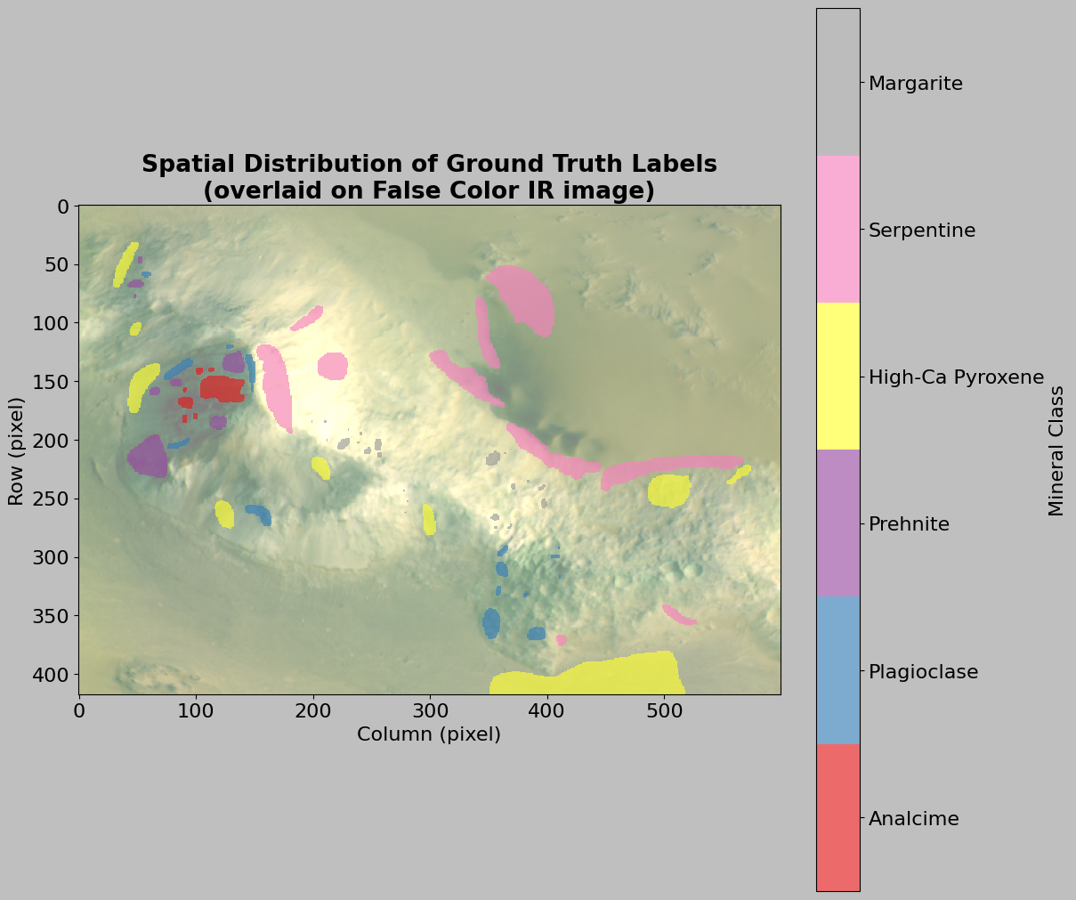
5.4 Visualizing Annotations Spatially
Let us visualize where each class is located in the image.
[15]:
# Create a color-mapped visualization of annotations with false color background
fig, ax = plt.subplots(figsize=(12, 10), layout="constrained")

# Create false color image for background
# We'll use bands around 2300, 1500, 1000 nm (False Color IR combination)
# This combination is good for highlighting mineral features
r_idx = find_band_index(2300)
g_idx = find_band_index(1500)
b_idx = find_band_index(1000)

# Extract the three bands
# Remember: [:, :, idx] means "all rows, all columns, specific band"
r_band = img_data.hsi[:, :, r_idx]
g_band = img_data.hsi[:, :, g_idx]
b_band = img_data.hsi[:, :, b_idx]

# Stack into RGB image
# np.dstack stacks arrays along the third (depth) dimension
rgb = np.dstack([r_band, g_band, b_band])

# Normalize to 0-1 range using percentiles (avoids extreme outliers)
rgb_min = np.percentile(rgb, 2)  # 2nd percentile
rgb_max = np.percentile(rgb, 98)  # 98th percentile
# Normalize and clip to ensure values stay in [0, 1]
rgb_normalized = np.clip((rgb - rgb_min) / (rgb_max - rgb_min), 0, 1)

# Display false color image with transparency
# alpha=0.5 makes it semi-transparent so we can see annotations on top
ax.imshow(rgb_normalized, alpha=0.5)

# Create a masked array to hide background (label 0)
# np.ma.masked_where creates a masked array where condition is True
# This allows us to show only the labeled pixels, not the background
masked_labels = np.ma.masked_where(ann_data.labels == 0, ann_data.labels)

# Create a custom colormap for the different classes
# ListedColormap creates a colormap from a list of colors
# We need one color for each class (excluding background)
cmap = mpl.colors.ListedColormap(
    plt.cm.Set1(np.linspace(0, 1, len(unique_labels) - 1))
)

# Display annotations on top with colormap
# interpolation="nearest" prevents blurring of the discrete labels
# alpha=0.65 makes annotations semi-transparent
im = ax.imshow(masked_labels, cmap=cmap, interpolation="nearest", alpha=0.65)

# Add colorbar with mineral names
cbar = plt.colorbar(im, ax=ax)
# Calculate tick positions for the colorbar
# We want ticks centered on each color in the colorbar
dx = (len(unique_labels) - 2) / (len(unique_labels) - 1)
# np.arange creates evenly spaced values from 1 to len-1 with step dx
ticks = np.arange(1, len(unique_labels) - 1, dx)
cbar.set_ticks(ticks + dx / 2.0)  # Shift ticks to be centered

# Use mineral names instead of numeric labels for the colorbar
# List comprehension to get names for all non-background labels
mineral_names = [
    ann_data.label_names.get(lab, f"Unknown (ID: {lab})")
    for lab in unique_labels
    if lab != 0
]
cbar.set_ticklabels(mineral_names)
cbar.set_label("Mineral Class")

# Add title and axis labels
ax.set_title(
    "Spatial Distribution of Ground Truth Labels\n(overlaid on False Color IR image)",
    fontweight="bold",
)
ax.set_xlabel("Column (pixel)")
ax.set_ylabel("Row (pixel)")

plt.show()
5.5 Using HSIMars Display Methods
The HSIMars class provides convenient visualization methods. Let’s use them to see the overlay.
[16]:
# This will open an OpenCV window showing three panels:
# - Left: False-color HSI
# - Middle: Annotations
# - Right: Overlay
print("Note: The display() method opens an OpenCV window.")
print("Press any key on the keyboard to close it.")
print("\nDisplaying image with annotations overlay...")

hsi.display()

print("✅ Display complete!")
Note: The display() method opens an OpenCV window.
Press any key on the keyboard to close it.

Displaying image with annotations overlay...
✅ Display complete!
✅ Display complete!
6. Statistical Analysis
Consider now an exploratory data analysis to understand the data distribution and quality.
6.1 Overall Image Statistics
First, consider global statistics across the entire hyperspectral cube.
[17]:
# Calculate statistics for the entire hyperspectral image cube
print("=" * 50)
print("GLOBAL IMAGE STATISTICS")
print("=" * 50)
# .min() finds the smallest value in the entire 3D array
print(f"Minimum value: {img_data.hsi.min():.4f}")
# .max() finds the largest value
print(f"Maximum value: {img_data.hsi.max():.4f}")
# .mean() computes the average across all pixels and all bands
print(f"Mean value: {img_data.hsi.mean():.4f}")
# .std() computes the standard deviation (measure of spread/variability)
print(f"Standard deviation: {img_data.hsi.std():.4f}")
# np.median() finds the middle value when all values are sorted
print(f"Median value: {np.median(img_data.hsi):.4f}")
print("=" * 50)

# Create visualizations of the pixel value distribution
fig, ax = plt.subplots(1, 2, figsize=(14, 5), layout="constrained")

# First subplot: Histogram of all pixel values
ax1 = ax[0]
# .ravel() flattens the 3D array into a 1D array
# bins=100 creates 100 bins to group the values
# density=True normalizes the histogram to show probability density
# edgecolor="black" adds black lines around each bar
ax1.hist(
    img_data.hsi.ravel(),  # Flatten to 1D
    bins=100,  # Number of bins
    density=True,  # Normalize to probability density
    edgecolor="black",
    alpha=0.7,  # Slight transparency
)
ax1.set_xlabel("Pixel Value")
ax1.set_ylabel("Density")
ax1.set_title("Distribution of All Pixel Values", fontweight="bold")
ax1.grid(True, alpha=0.3)  # Add subtle grid

# Second subplot: Histogram with percentile clipping for better visualization
ax2 = ax[1]
# np.percentile() finds the values at the 2nd and 98th percentiles
# This helps us focus on the main distribution, ignoring extreme outliers
p2, p98 = np.percentile(img_data.hsi.ravel(), [2, 98])
# Create a copy of the flattened data
clipped_data = img_data.hsi.ravel()
# Filter: keep only values between p2 and p98
# The & operator combines two boolean conditions with "and"
clipped_data = clipped_data[(clipped_data >= p2) & (clipped_data <= p98)]

ax2.hist(
    clipped_data,
    bins=100,
    density=True,
    edgecolor="black",
    alpha=0.7,
    color="orange",  # Different color to distinguish from first plot
)
ax2.set_xlabel("Pixel Value")
ax2.set_ylabel("Density")
ax2.set_title("Distribution (2nd - 98th Percentile)", fontweight="bold")
ax2.grid(True, alpha=0.3)

plt.show()
==================================================
GLOBAL IMAGE STATISTICS
==================================================
Minimum value: 0.0496
Maximum value: 0.5765
Mean value: 0.1934
Standard deviation: 0.0651
Standard deviation: 0.0651
Median value: 0.1972
==================================================
Median value: 0.1972
==================================================
6.2 Band-wise Statistics
Different spectral bands can have very different characteristics.
[ ]:
# Calculate statistics for each spectral band individually
# This helps us understand how different wavelengths behave

# Calculate mean for each band by averaging over the spatial dimensions
# axis=(0, 1) means "average over rows (0) and columns (1)"
# Result: 1D array with one value per spectral band
band_means = img_data.hsi.mean(axis=(0, 1))

# Calculate standard deviation for each band
band_stds = img_data.hsi.std(axis=(0, 1))

# Find minimum and maximum values for each band
band_mins = img_data.hsi.min(axis=(0, 1))
band_maxs = img_data.hsi.max(axis=(0, 1))

# Create comprehensive band statistics plot with 3 subplots stacked
# vertically
fig, ax = plt.subplots(3, 1, figsize=(14, 10), layout="constrained")

# First subplot: Mean reflectance per band
ax1 = ax[0]
# Plot mean values as a line
ax1.plot(img_data.wavelength, band_means, "b-", linewidth=1.5)
# fill_between() creates a shaded region showing ±1 standard deviation
# This shows the typical range of variability around the mean
ax1.fill_between(
    img_data.wavelength,  # x values
    band_means - band_stds,  # Lower bound (mean - 1 std)
    band_means + band_stds,  # Upper bound (mean + 1 std)
    alpha=0.3,  # Semi-transparent
    label="±1 std",  # Label for legend
)
# Add colored background regions for spectral categories
ax1.axvspan(wl.min(), 750, alpha=0.1, color="green")  # Visible
ax1.axvspan(750, 1400, alpha=0.1, color="red")  # NIR
ax1.axvspan(1400, 3000, alpha=0.1, color="blue")  # SWIR
ax1.axvspan(3000, wl.max(), alpha=0.1, color="magenta")  # MWIR
ax1.set_ylabel("Mean Reflectance")
ax1.set_title("Average Spectrum Across Entire Image", fontweight="bold")
ax1.legend()  # Show the "±1 std" label
ax1.grid(True, alpha=0.3)

# Second subplot: Standard deviation per band
# High std means that band varies a lot across the image
# (useful for discrimination)
ax2 = ax[1]
ax2.plot(img_data.wavelength, band_stds, "r-", linewidth=1.5)
ax2.axvspan(wl.min(), 750, alpha=0.1, color="green")
ax2.axvspan(750, 1400, alpha=0.1, color="red")
ax2.axvspan(1400, 3000, alpha=0.1, color="blue")
ax2.axvspan(3000, wl.max(), alpha=0.1, color="magenta")
ax2.set_ylabel("Standard Deviation")
ax2.set_title("Spatial Variability per Band", fontweight="bold")
ax2.grid(True, alpha=0.3)

# Third subplot: Dynamic range per band
# Dynamic range = max - min (shows the total range of values in each band)
ax3 = ax[2]
ax3.plot(img_data.wavelength, band_maxs - band_mins, "g-", linewidth=1.5)
ax3.axvspan(wl.min(), 750, alpha=0.1, color="green")
ax3.axvspan(750, 1400, alpha=0.1, color="red")
ax3.axvspan(1400, 3000, alpha=0.1, color="blue")
ax3.axvspan(3000, wl.max(), alpha=0.1, color="magenta")
ax3.set_xlabel("Wavelength (nm)")
ax3.set_ylabel("Dynamic Range")
ax3.set_title("Dynamic Range per Band (Max - Min)", fontweight="bold")
ax3.grid(True, alpha=0.3)

plt.show()

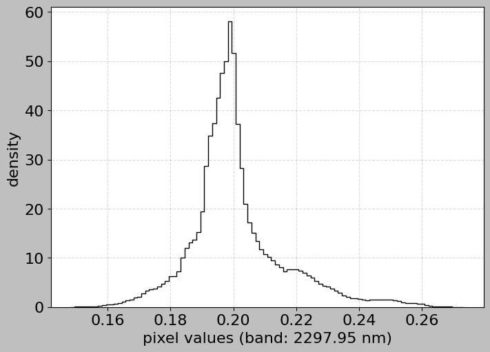
6.3 Histogram for Specific Bands
We can also use the HSIMars method to examine the distribution in specific bands of interest.
[19]:
# Plot histogram for a band in the SWIR region (important for minerals)
swir_wavelength = 2300.0  # Around carbonate absorption
print(f"Plotting histogram for band near {swir_wavelength} nm...")
print("This wavelength is important for detecting carbonates!")

hsi.plot_histogram(band=swir_wavelength)
Plotting histogram for band near 2300.0 nm...
This wavelength is important for detecting carbonates!
7. Class-Specific Spectral Analysis
Now let us connect the spectral data with the ground truth labels. This is crucial for understanding what makes each class distinguishable.
[ ]:
# Extract mean spectra for each labeled class
# This helps us understand what spectral signature characterizes
# each mineral class
print("Calculating mean spectra for each class...")

# Initialize empty dictionaries to store results
# Dictionaries use label IDs as keys
class_spectra = {}  # Will store mean spectrum for each class
class_std = {}  # Will store standard deviation spectrum for each class

# Loop through each unique label
for label in unique_labels:
    if label == 0:  # Skip background (label 0)
        continue

    # Create a boolean mask: True where labels match, False otherwise
    # This mask has the same shape as ann_data.labels (height x width)
    mask = ann_data.labels == label

    # Extract all pixels belonging to this class
    # img_data.hsi[mask] uses boolean indexing to select only pixels
    # where mask is True
    # Result: 2D array with shape (num_pixels_in_class, num_channels)
    pixels = img_data.hsi[mask]

    # Calculate statistics across all pixels in this class
    # axis=0 means "average across pixels" (keeping all spectral bands)
    # Result: 1D array with shape (num_channels,) - one value per
    # wavelength
    class_spectra[label] = pixels.mean(axis=0)
    class_std[label] = pixels.std(axis=0)

    # Get human-readable name and print info
    class_name = ann_data.label_names.get(label, f"Unknown (ID: {label})")
    # np.sum(mask) counts how many True values are in the mask
    print(f"  {class_name}: {np.sum(mask)} pixels")

print("\n✅ Class spectra calculated!")
Calculating mean spectra for each class...
  Analcime: 940 pixels
  Plagioclase: 1472 pixels
  Prehnite: 1560 pixels
  High-Ca Pyroxene: 6963 pixels
  Serpentine: 8697 pixels
  Margarite: 458 pixels

✅ Class spectra calculated!
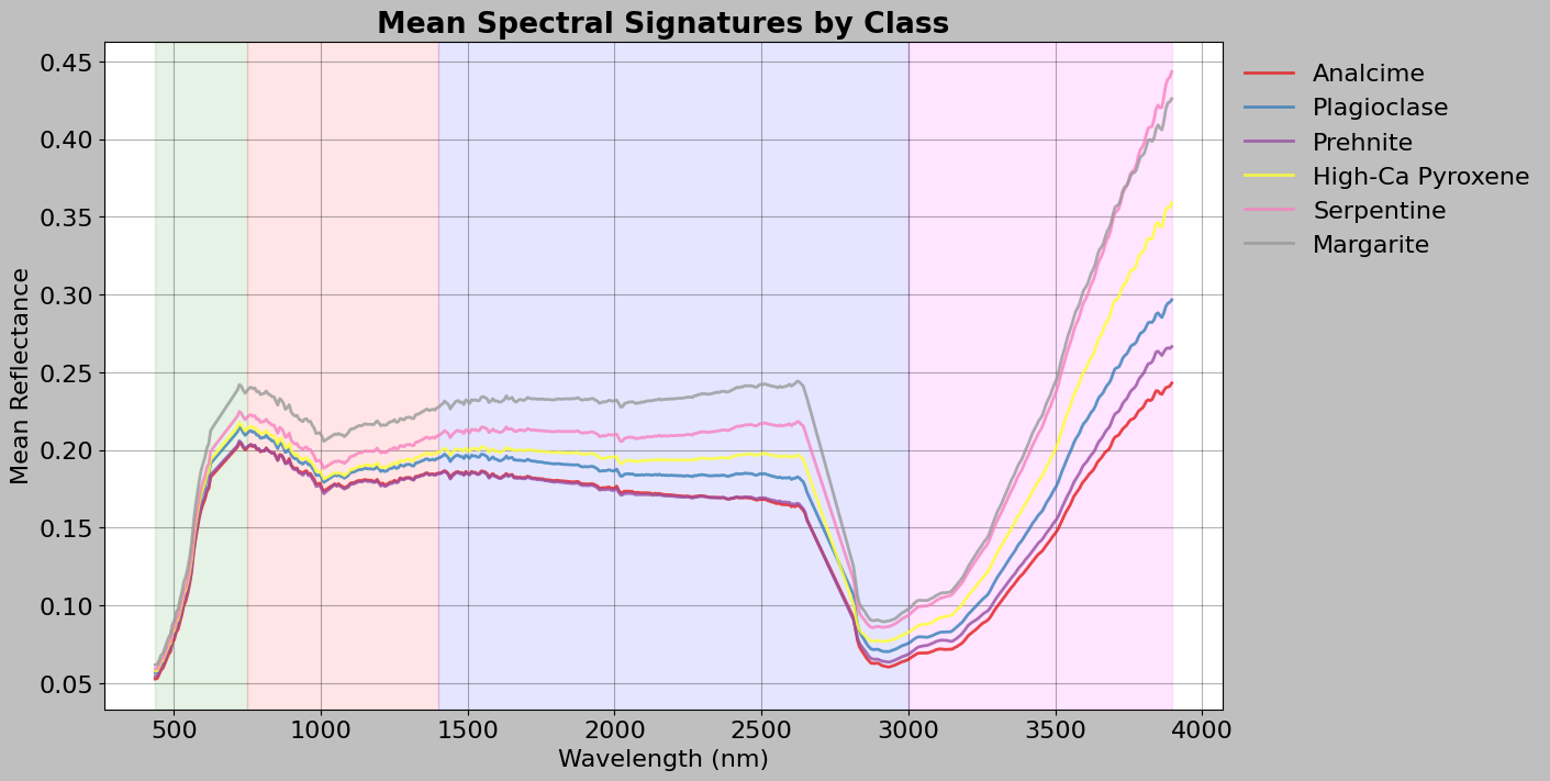
[21]:
# Plot mean spectra for all classes on the same graph
# This allows us to visually compare the spectral signatures of different minerals
fig, ax = plt.subplots(figsize=(14, 7), layout="constrained")

# Generate distinct colors for each class
colors = plt.cm.Set1(np.linspace(0, 1, len(class_spectra)))

# Loop through each class and its mean spectrum
# .items() returns pairs of (key, value) from the dictionary
# zip() pairs each dictionary item with a color
for (label, spectrum), color in zip(class_spectra.items(), colors):
    # Get human-readable name for the legend
    class_name = ann_data.label_names.get(label, f"Unknown (ID: {label})")

    # Plot this class's mean spectrum
    ax.plot(
        img_data.wavelength,  # x-axis: wavelengths
        spectrum,  # y-axis: mean reflectance values
        label=class_name,  # Legend label
        linewidth=2,  # Line thickness
        alpha=0.8,  # Slight transparency
        color=color,  # Distinct color for this class
    )

# Add colored background regions to show spectral categories
ax.axvspan(wl.min(), 750, alpha=0.1, color="green")  # Visible
ax.axvspan(750, 1400, alpha=0.1, color="red")  # Near-IR
ax.axvspan(1400, 3000, alpha=0.1, color="blue")  # Short-wave IR
ax.axvspan(3000, wl.max(), alpha=0.1, color="magenta")  # Mid-wave IR

# Add labels and formatting
ax.set_xlabel("Wavelength (nm)")
ax.set_ylabel("Mean Reflectance")
ax.set_title("Mean Spectral Signatures by Class", fontweight="bold")
# Place legend outside plot area on the right
ax.legend(loc="upper left", bbox_to_anchor=(1, 1), frameon=False)
ax.grid(True, alpha=0.3)

plt.show()
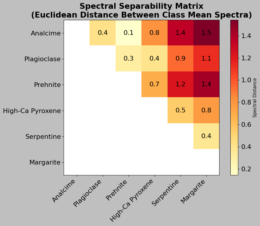
[ ]:
# Calculate spectral separability between classes
# This tells us how different the spectral signatures are from each other
# Import the distance calculation functions from scipy
from scipy.spatial.distance import pdist, squareform

# Create a matrix of mean spectra (one row per class)
# First, get a sorted list of class labels (for consistent ordering)
labels_list = sorted([lab for lab in class_spectra.keys()])
# Convert dictionary to a 2D numpy array: each row is a class's mean
# spectrum. np.array() with a list comprehension creates the matrix
spectra_matrix = np.array([class_spectra[lab] for lab in labels_list])

# Calculate pairwise Euclidean distances between all classes
# pdist() computes distance between every pair of rows
# metric="euclidean" means we use standard Euclidean distance
# Result is a condensed distance matrix (1D array of unique distances)
distances = squareform(pdist(spectra_matrix, metric="euclidean"))
# squareform() converts the 1D array to a 2D symmetric matrix

# Create a mask to hide the lower triangle (distances are symmetric,
# so we only need upper triangle)
# np.tri() creates a lower triangular matrix of 1s
mask = np.tri(distances.shape[0])
# np.ma.array creates a masked array where mask=True values are hidden
distances = np.ma.array(distances, mask=mask)

# Get human-readable names for the labels (for axis labels)
mineral_names = [
    ann_data.label_names.get(lab, f"Unknown (ID: {lab})")
    for lab in labels_list
]

# Visualize the distance matrix as a heatmap
fig, ax = plt.subplots(figsize=(10, 8))
# imshow() displays 2D array as an image
# cmap="YlOrRd" is a yellow-orange-red colormap
# (light = similar, dark = different)
# interpolation="nearest" prevents blurring of values
im = ax.imshow(distances, cmap="YlOrRd", interpolation="nearest")

# Add colorbar to show what the colors mean
cbar = plt.colorbar(im, ax=ax)
cbar.set_label("Spectral Distance", fontsize=11)

# Set tick positions and labels to show mineral names
ax.set_xticks(range(len(labels_list)))  # Tick at each integer position
ax.set_yticks(range(len(labels_list)))
# Rotate for readability
ax.set_xticklabels(mineral_names, rotation=45, ha="right")
ax.set_yticklabels(mineral_names)

# Add text annotations showing the exact distance values
# Loop through the upper triangle of the matrix
for i in range(len(labels_list)):
    for j in range(i + 1, len(labels_list)):  # j > i (upper triangle only)
        # Add text at position (j, i) showing the distance value
        # ha="center" means horizontally centered
        # va="center" means vertically centered
        text = ax.text(
            j,
            i,
            f"{distances[i, j]:.1f}",  # Format to 1 decimal place
            ha="center",
            va="center",
            color="black",
        )

ax.set_title(
    "Spectral Separability Matrix\n"
    "(Euclidean Distance Between Class Mean Spectra)",
    fontweight="bold",
)

plt.tight_layout()
plt.show()
8. Feature Engineering Considerations
Before applying machine learning, we need to think about features. Since we work with spectra, we can use them as features directly (even though feature engineering might still be beneficial).
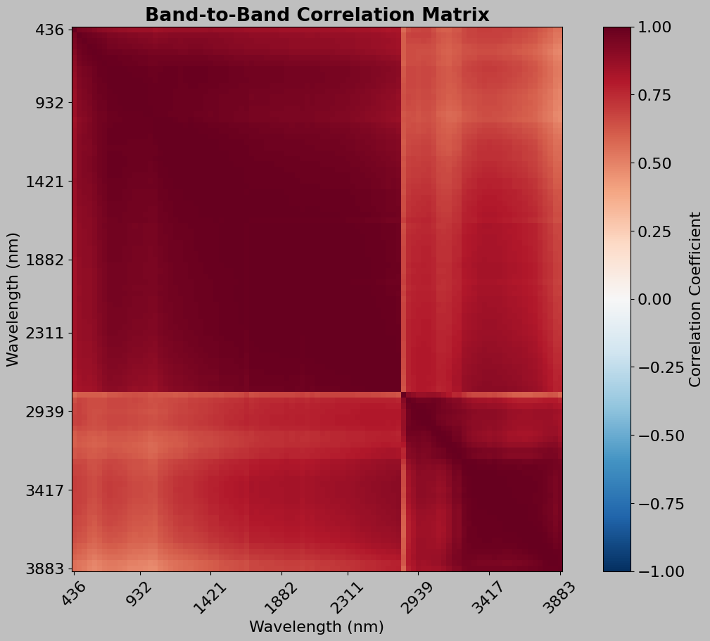
8.1 Correlation Between Bands
Adjacent spectral bands are often highly correlated (redundant information).
[ ]:
# Calculate correlation matrix to see how spectral bands relate to
# each other. High correlation between bands means they contain similar
# information (redundancy)

# Use a subset of bands for computational efficiency
# np.arange(start, stop, step) creates [0, 5, 10, 15, ...]
# This samples every 5th band instead of using all bands
sample_indices = np.arange(0, img_data.channels, 5)
sample_wavelengths = img_data.wavelength[sample_indices]

# Reshape the 3D hyperspectral cube to 2D for correlation calculation
# Original shape: (height, width, channels)
# Target shape: (n_pixels, n_channels) where n_pixels = height × width
n_pixels = img_data.height * img_data.width
# .reshape() changes the shape while keeping all data
# -1 means "calculate this dimension automatically"
hsi_reshaped = img_data.hsi.reshape(n_pixels, -1)

# Extract only the sampled bands
# [:, sample_indices] means "all rows, only columns in sample_indices"
hsi_subset = hsi_reshaped[:, sample_indices]

# Calculate correlation matrix
# np.corrcoef() computes Pearson correlation coefficients
# .T transposes the matrix so bands are rows (corrcoef correlates rows)
print(f"Calculating correlation matrix for {len(sample_indices)} bands...")
print("(Using subset for computational efficiency)")
correlation_matrix = np.corrcoef(hsi_subset.T)

# Plot the correlation matrix as a heatmap
fig, ax = plt.subplots(figsize=(10, 9), layout="constrained")
# Display the correlation matrix as an image
# cmap="RdBu_r" is a red-blue colormap (reversed)
# vmin=-1, vmax=1 sets the scale from -1 (negative correlation)
# to 1 (positive correlation)
# aspect="auto" allows non-square pixels
im = ax.imshow(
    correlation_matrix,
    cmap="RdBu_r",
    vmin=-1,
    vmax=1,
    interpolation="nearest",
    aspect="auto",
)

# Add colorbar showing correlation scale
cbar = plt.colorbar(im, ax=ax)
cbar.set_label("Correlation Coefficient")

# Set tick labels to show wavelengths instead of indices
# np.linspace creates evenly spaced positions for ticks
tick_positions = np.linspace(0, len(sample_indices) - 1, 8).astype(int)
ax.set_xticks(tick_positions)
ax.set_yticks(tick_positions)
# Set labels to show actual wavelengths, rounded to integers
ax.set_xticklabels(
    [f"{sample_wavelengths[i]:.0f}" for i in tick_positions], rotation=45
)
ax.set_yticklabels([f"{sample_wavelengths[i]:.0f}" for i in tick_positions])

ax.set_xlabel("Wavelength (nm)")
ax.set_ylabel("Wavelength (nm)")
ax.set_title("Band-to-Band Correlation Matrix", fontweight="bold")

plt.show()
Calculating correlation matrix for 97 bands...
(Using subset for computational efficiency)
[ ]:
# Perform data quality checks to identify potential issues
print("=" * 70)
print("DATA QUALITY CHECKS")
print("=" * 70)

# Check for NaN (Not a Number) values
# np.isnan() creates a boolean array: True where value is NaN
# np.sum() counts the True values
n_nan = np.sum(np.isnan(img_data.hsi))
print(f"✓ NaN values: {n_nan}")

# Check for Inf (Infinity) values
# np.isinf() creates a boolean array: True where value is infinite
n_inf = np.sum(np.isinf(img_data.hsi))
print(f"✓ Inf values: {n_inf}")

# Check for negative values (unusual in reflectance data,
# which should be non-negative)
# Create boolean array where condition is True
n_negative = np.sum(img_data.hsi < 0)
# Calculate percentage
pct_negative = 100 * n_negative / img_data.hsi.size
print(f"✓ Negative values: {n_negative} ({pct_negative:.3f}%)")

# Check for zero values
n_zero = np.sum(img_data.hsi == 0)
pct_zero = 100 * n_zero / img_data.hsi.size
print(f"✓ Zero values: {n_zero} ({pct_zero:.3f}%)")

# Check dynamic range (difference between min and max)
print(f"\n✓ Value range: [{img_data.hsi.min():.4f}, {img_data.hsi.max():.4f}]")
print(f"✓ Mean ± std: {img_data.hsi.mean():.4f} ± {img_data.hsi.std():.4f}")

# Identify potential outlier pixels (very bright or very dark)
# Calculate mean reflectance for each pixel (averaging across all bands)
# axis=2 means "average over the spectral dimension"
pixel_means = img_data.hsi.mean(axis=2)

# Find the 1st and 99th percentile thresholds
# Pixels outside this range are potential outliers
mean_threshold_low = np.percentile(pixel_means, 1)
mean_threshold_high = np.percentile(pixel_means, 99)

# Count pixels outside the threshold range
# The | operator is "or" for boolean arrays
n_outliers = np.sum(
    (pixel_means < mean_threshold_low) | (pixel_means > mean_threshold_high)
)
pct_outliers = 100 * n_outliers / (img_data.height * img_data.width)
print(
    f"\n✓ Potential outlier pixels (outside 1-99 percentile): "
    f"{n_outliers} ({pct_outliers:.2f}%)"
)

print("=" * 70)
======================================================================
DATA QUALITY CHECKS
======================================================================
✓ NaN values: 0
✓ Inf values: 0
✓ Negative values: 0 (0.000%)
✓ Zero values: 0 (0.000%)

✓ Value range: [0.0496, 0.5765]
✓ Negative values: 0 (0.000%)
✓ Zero values: 0 (0.000%)

✓ Value range: [0.0496, 0.5765]
✓ Mean ± std: 0.1934 ± 0.0651

✓ Potential outlier pixels (outside 1-99 percentile): 5016 (2.00%)
======================================================================
✓ Mean ± std: 0.1934 ± 0.0651

✓ Potential outlier pixels (outside 1-99 percentile): 5016 (2.00%)
======================================================================